The Power of Visual Communication in Winning Bids: A Lesson from Jackson Yew’s Graphic
When it comes to putting together bid documents, the way you present your information can make all the difference. The concept of visual communication is crucial , and there’s a great example from Jackson Yew, a well-known expert in visual hierarchy, that perfectly illustrates this.
His work shows just how effective a well-laid-out document can be in guiding a reader’s attention and helping them understand your message—something that’s especially important when you’re competing for big contracts.

Understanding Visual Hierarchy
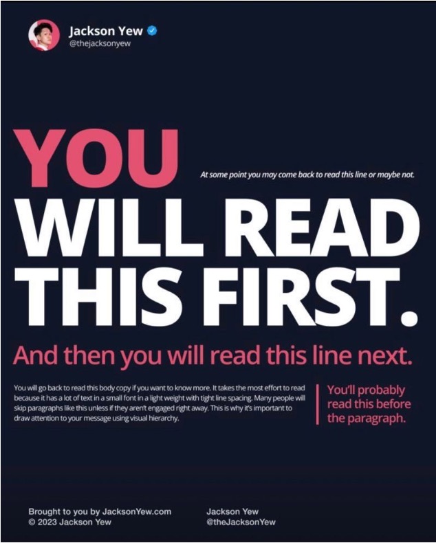
Jackson Yew’s graphic is a brilliant demonstration of visual hierarchy using typography and layout. The first thing you see is the bold, large text that says, “YOU WILL READ THIS FIRST.” And guess what? You do read it first! Then your eyes naturally move on to the next line, “And then you will read this line next,” which is slightly smaller but still stands out. This simple sequence shows how you can direct a reader’s eyes through content in a specific order, making sure they catch the most important points.
Application to Bid Documents
When you’re preparing a bid, you need it to be clear and engaging from the get-go. Many bid documents end up looking dense and a bit overwhelming, which can put evaluators off. This is where applying principles of visual hierarchy can make your bid stand out. For a deeper understanding of how a bid graphic designer can enhance your proposals, read more about the role of a bid graphic designer.
Here are a few things to consider:
- Branding: Make sure you’re using consistent colours, fonts, and logos throughout your document. This not only reinforces your company’s identity but also helps your bid stick in the evaluator’s mind.
- Typography: Play around with font sizes and weights to create a clear distinction between headings, subheadings, and body text. This way, you’re guiding the reader through your document without them even realising it.
- Layout: Where you place your text and images matters a lot. Strategic placement can highlight the most important information and make sure evaluators focus on what you want them to see.
How Visual Communication Elevates Your Bid
Getting the visual communication right in your bid isn’t just about making it look nice—it can actually make your bid more persuasive. Here’s how:
- Enhanced Readability: A well-structured document is so much easier to read. Evaluators can quickly get the gist of your main points without having to wade through walls of text.
- Professionalism: A visually appealing bid shows that you’re professional and pay attention to detail. This can give evaluators confidence in your ability to deliver on your promises.
- Engagement: Let’s be honest, a well-designed layout can capture and hold attention better than a plain, boring page. If your bid is more engaging, it’s going to stand out against the competition.
Conclusion
Investing a bit of time and effort into how your bid looks can really pay off. Visual communication isn’t just about making things pretty; it’s a strategic tool that can boost the clarity and impact of your message. By using visual hierarchy, consistent branding, and thoughtful typography, you can create bid documents that don’t just communicate your message—they leave a lasting impression.
At Perfect Media®, we’re experts in enhancing visual communication in bid documents. We make sure your bids are not only professionally crafted but also designed in a way that maximises readability and impact. Let us help you turn your bids into winning documents.


